How Light Shapes Color
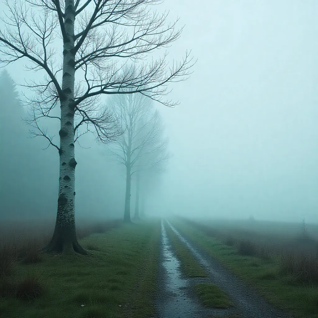
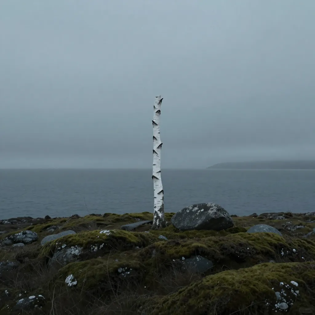
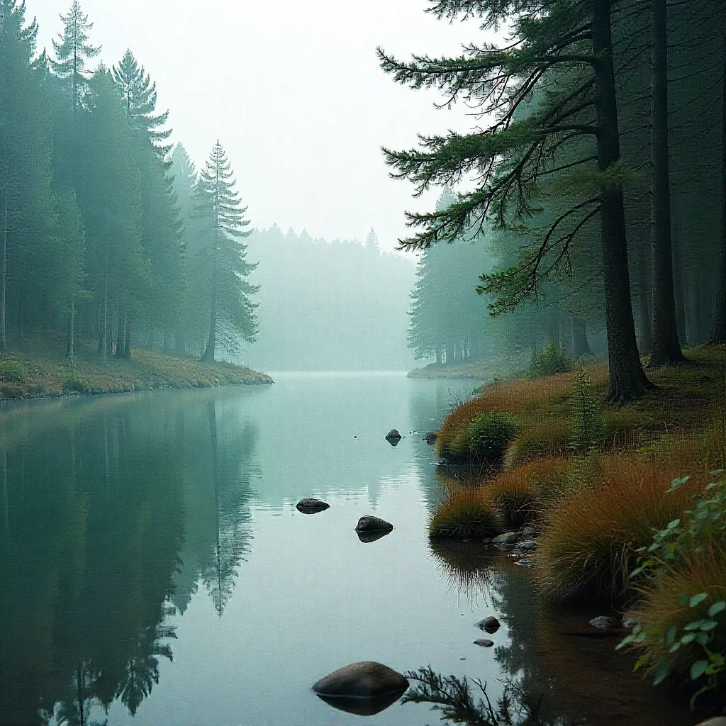
Northern light behaves differently than southern light. It's bluer, lower in the sky, and creates unique interactions with pigments. Understanding these differences helps you choose colors that work harmoniously in Nordic environments.
The Blue Shift
Northern light contains more blue wavelengths than southern light. This blue shift affects how colors appear—warm tones that look inviting in a magazine might appear cold and grey in a Helsinki apartment.
Our palettes account for this shift by incorporating colors that maintain their intended character under blue-tinted light. We test each palette in actual Nordic lighting conditions to ensure colors read as intended.
This is why a "warm beige" from a southern design magazine can look "cold grey" in northern spaces. The solution isn't to avoid warm tones, but to select warm tones that have enough saturation to hold their warmth under blue light.


Low-Angle Light
In northern latitudes, the sun stays lower in the sky throughout the day. This creates longer shadows and more dramatic light contrasts. Colors need to work in both bright, direct light and in shadow.
Our palettes include colors that maintain their character across these lighting extremes. We avoid colors that become muddy in shadow or washed out in direct light.
The result is a collection of colors that feel consistent and reliable, regardless of the time of day or weather conditions outside.
Compensating for Light
Saturation Balance
Colors need sufficient saturation to maintain their character under blue light. We carefully balance saturation levels to ensure colors read true in northern environments.
Temperature Considerations
Warm colors require careful selection to avoid appearing cool under blue light. Our warm tones include subtle cool undertones that prevent the blue shift from dominating.
Contrast Relationships
The relationship between colors matters more in low-angle light. Our palettes ensure sufficient contrast while maintaining harmony across lighting conditions.
Practical Application
When selecting colors for northern spaces, consider how they'll appear under blue-tinted, low-angle light. Test samples in the actual space at different times of day. Our palettes are designed to work harmoniously in these conditions, saving you the trial and error of adapting colors meant for different lighting environments.
