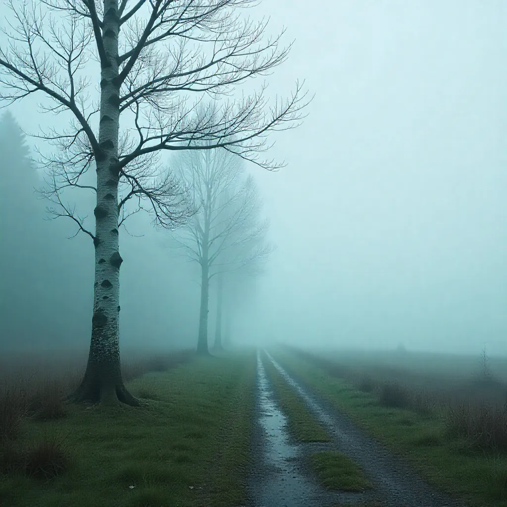
Discover Serene Hues
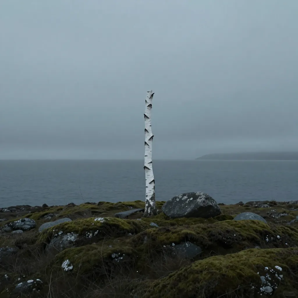
Fjord Mist
Cool, breathing grey-blue tones that evoke the calm of Nordic waters. These hues create a sense of spaciousness and peace in any environment.
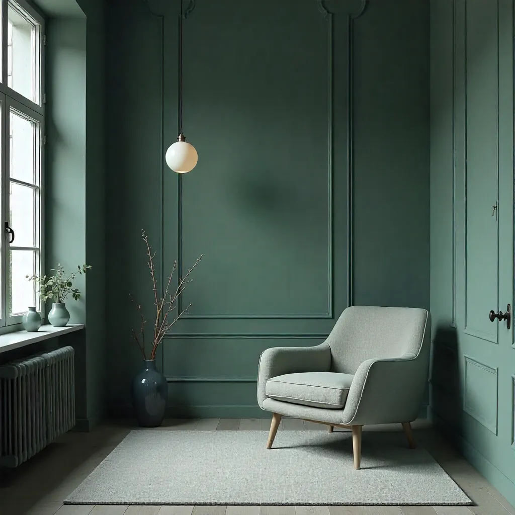
Forest Floor
Deep, desaturated greens that ground your space with the quiet strength of Nordic forests. Perfect for creating a restful atmosphere.
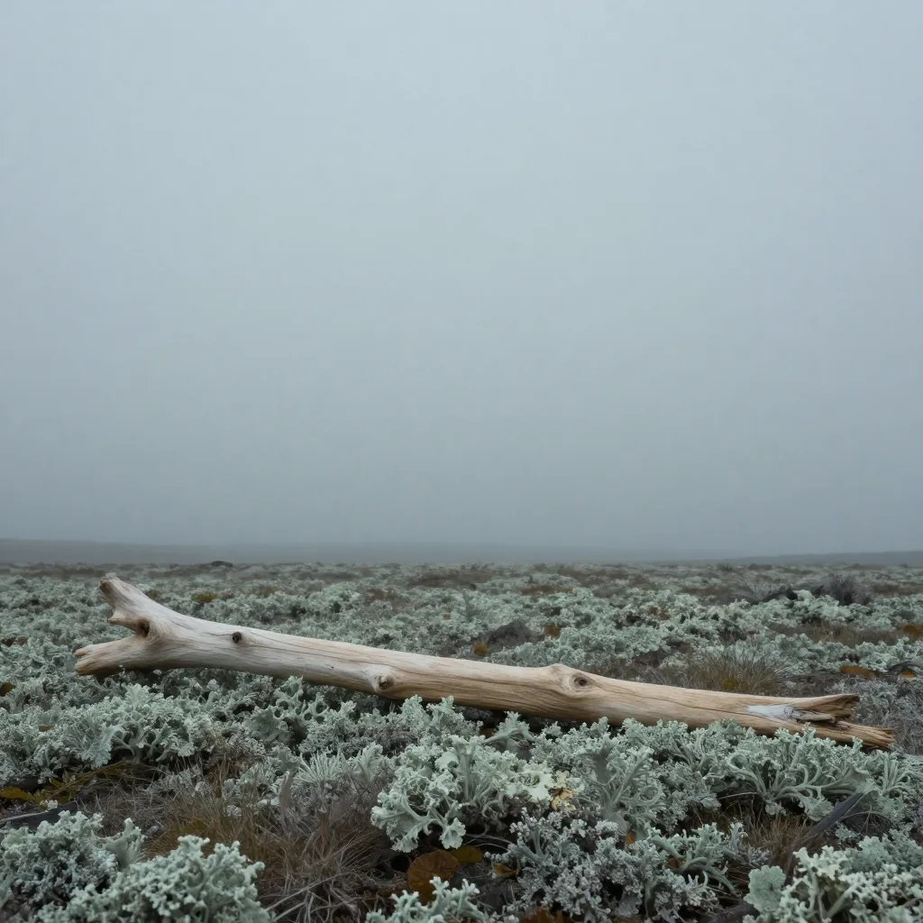
Arctic Sky
Soft, pale tones that mirror the gentle light of northern skies. These colors bring clarity and calm to interior spaces.
Nature-Driven Design
Our color palettes are drawn directly from the Nordic landscape—from the deep blues of fjords to the muted greens of moss-covered stones. Each palette reflects the quiet beauty of northern nature.
These colors work harmoniously together, creating environments that feel both grounded and expansive. Whether you're designing a living space or a workspace, these palettes provide a foundation for calm and clarity.
Explore Seasons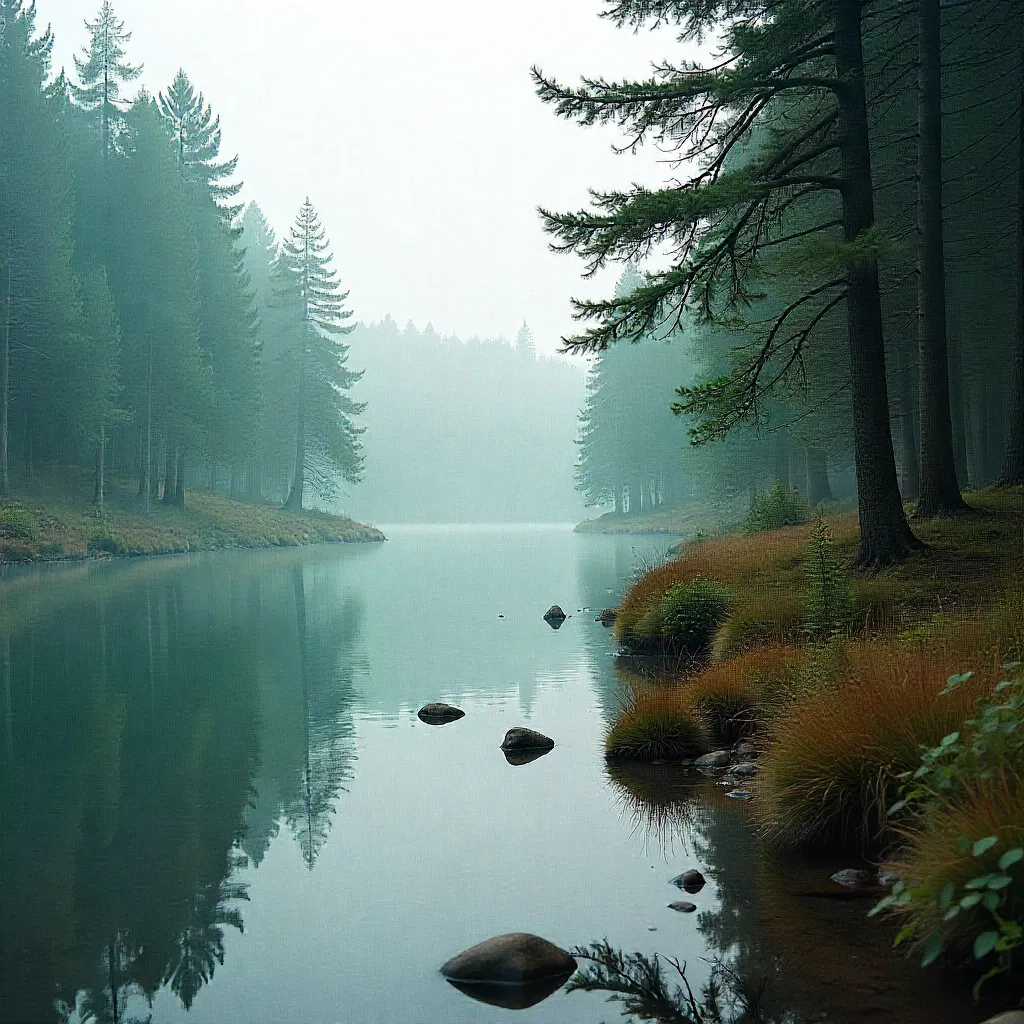
The Science of Serenity
Light Interaction
Northern light behaves differently than southern light. Our palettes account for this, ensuring colors appear as intended in various lighting conditions.
Visual Rest
These carefully selected hues reduce visual fatigue, creating spaces where the eye can rest and the mind can find peace.
Emotional Balance
Each palette is designed to support emotional well-being through color psychology rooted in natural environments.
From Landscape to Palette
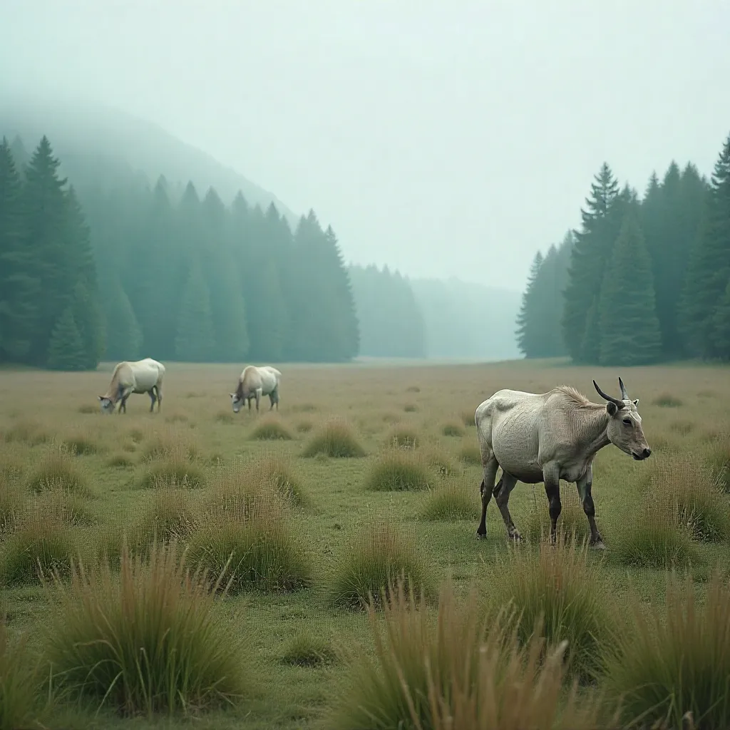
Every color in our collection begins with observation—a rusted fishing boat, a patch of reindeer moss, the way light filters through birch leaves. These natural moments become the foundation for palettes that bring the outdoors in.
We document these inspirations through photography, then translate them into usable color systems. The result is a collection that feels authentic, grounded, and deeply connected to place.
View Origins